In the world of interior design, “Blue” is more than just a primary color; it is a psychological tool. Studies consistently show that blue is the most effective color for inducing relaxation, lowering blood pressure, and promoting deep, restorative sleep. It is the color of the twilight sky and the deep ocean environments that our brains instinctively associate with safety and stillness.
However, a common problem persists: many homeowners yearn for color but are paralyzed by the fear that it will make their room feel “too dark,” “too busy,” or “too cold.” As a result, they default to safe, uninspired beige. This guide is your permission slip to embrace the blue. We will move beyond the fear, exploring how specific wallpaper styles from delicate biophilic florals to structured geometrics can transform your bedroom into a sanctuary. You will learn not just which pattern to pick, but how to expertly pair it with lighting and furniture to ensure your space feels warm, inviting, and effortlessly chic.
Choosing Your Shade: A Quick Design Guide
Before we unroll the paper, it is crucial to understand that “Blue” is a spectrum, and each shade dictates a different mood.
- Navy & Midnight: These deep, saturated hues create a “cocoon” effect. They blur the boundaries of a room, often making it feel deeper and more intimate. They are perfect for large rooms that feel too cavernous or for creating a dramatic accent wall behind a headboard.
- Sky & Powder Blue: These are “expanding” colors. Because they mimic the daytime sky, they trick the eye into perceiving the walls as receding, making small rooms feel airy and spacious. They are ideal for guest rooms or nurseries.
- Teal & Green-Blue: These shades contain warmth (yellow undertones) and bridge the gap between blue and green. They offer a biophilic, organic vibe that feels less “icy” than pure blue, making them excellent for rooms that receive low natural light.
The Decor Inspo’s Top 23 Blue Bedroom Wallpaper
I’ve put together a wide-ranging collection of ideas for you to explore below. If you find a look that you absolutely love, be sure to save it to your Pinterest board!
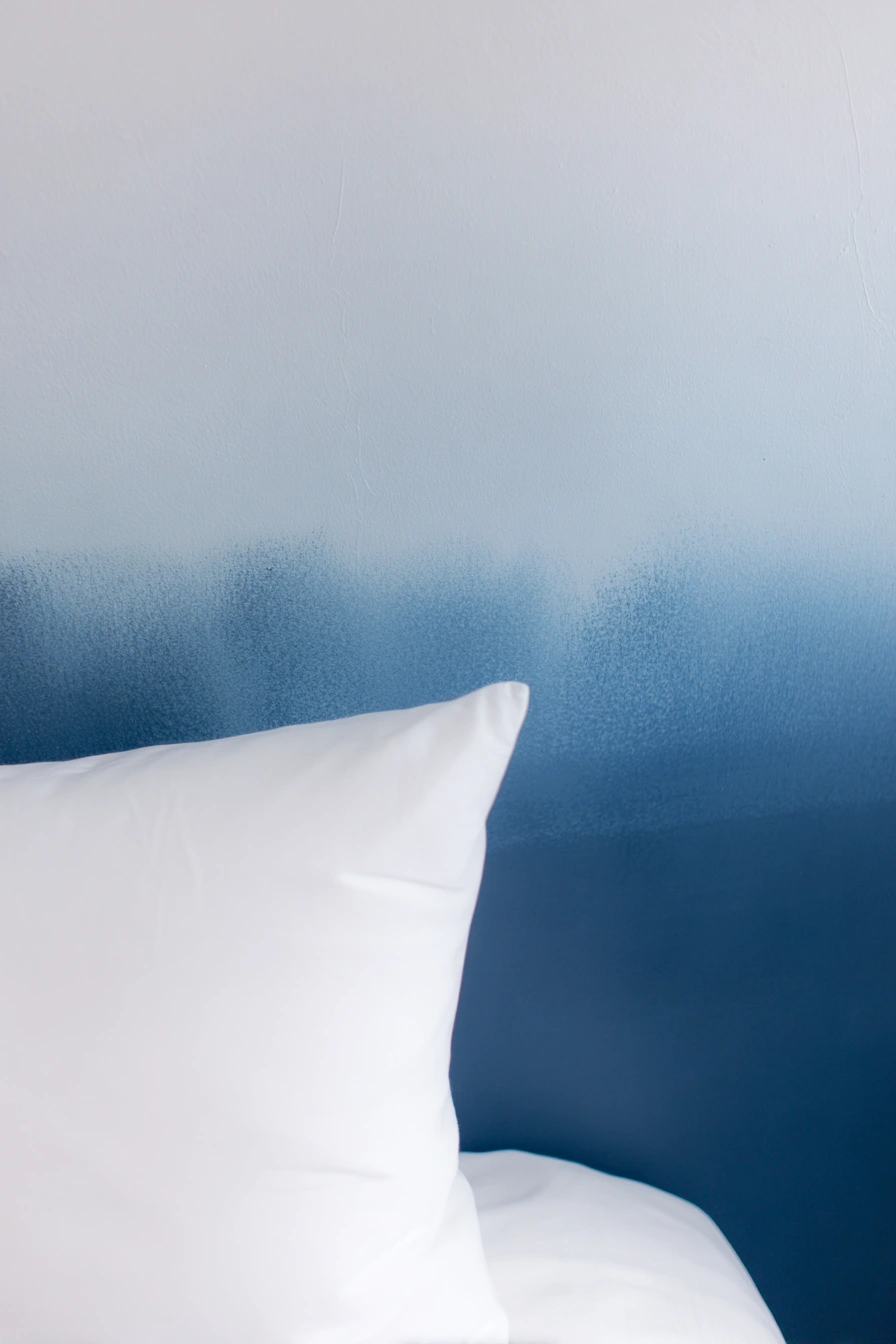
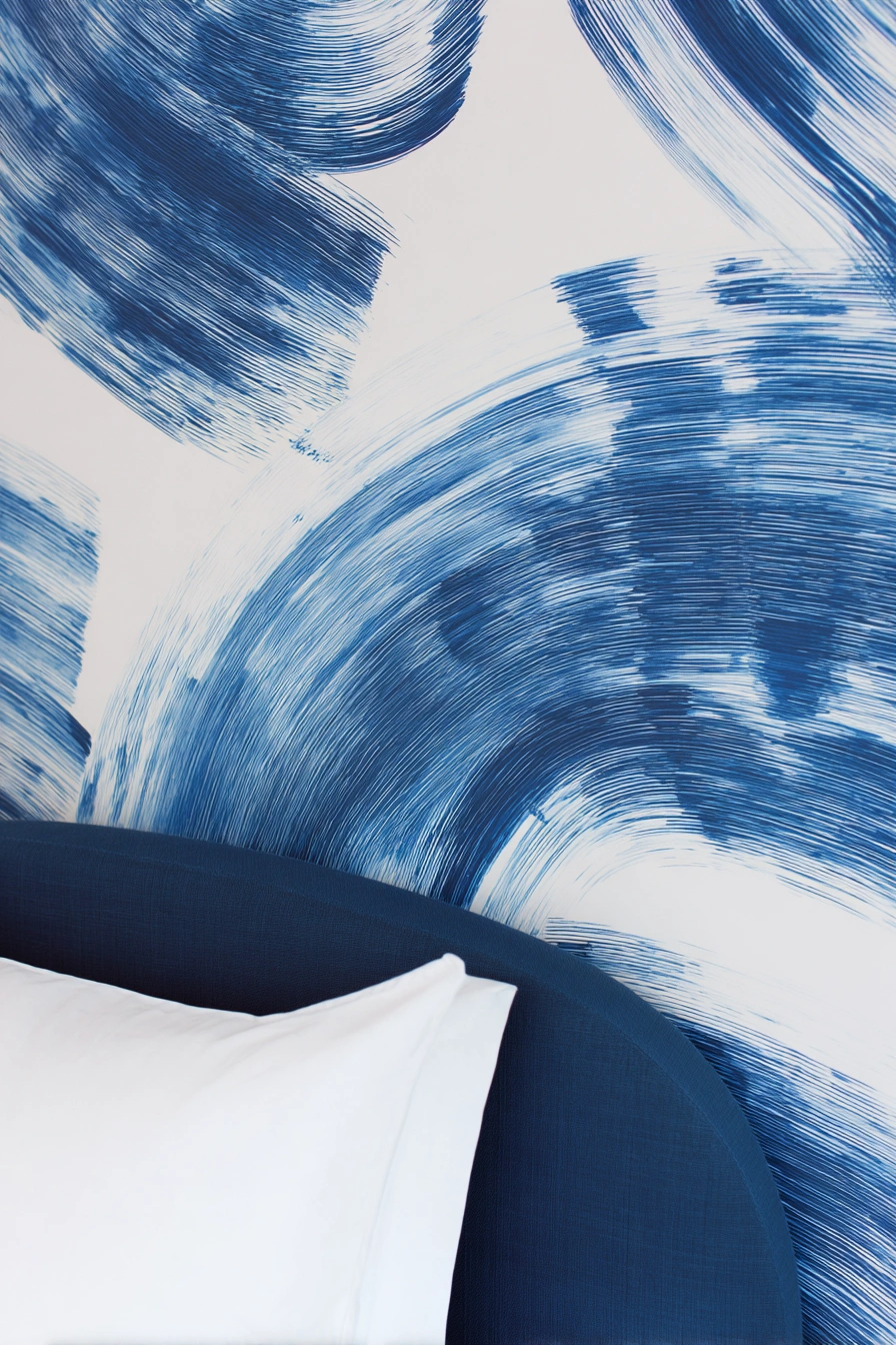
1) Soft Navy Ombre
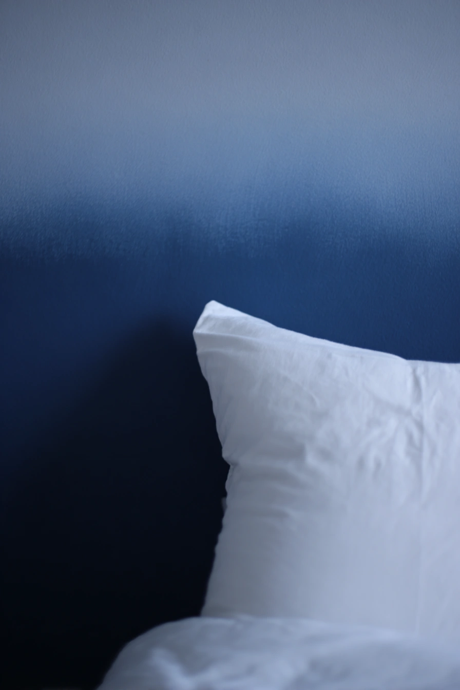
I’m completely charmed by the artistic ombre of this blue wallpaper. The way the deep navy melts into a softer sky tone gives the room immediate depth without feeling heavy, mimicking the transition of the evening sky. Its slightly brushed texture makes it look luxurious yet lived-in, avoiding the flatness of standard paint. It reads as cool and calm, making it perfect behind a bed as a headboard alternative or on a single wall in a small bedroom that needs a vertical focal point to draw the eye up.
2) Sky & Navy Geometrics
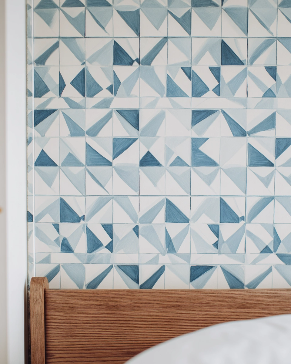
I love how this blue wallpaper gives the impression of hand-painted tiles. The small geometric triangles and soft navy strokes feel modern but still have a cozy, artisanal quality. The white background keeps the whole look light and airy, allowing it to become an instant focal wall behind a bed without overwhelming the room or shrinking the space. It looks stunning with warm wood tones and crisp linens and is perfect for small bedrooms, coastal-style apartments, or anyone wanting a fresh, designed-but-not-overdone vibe.
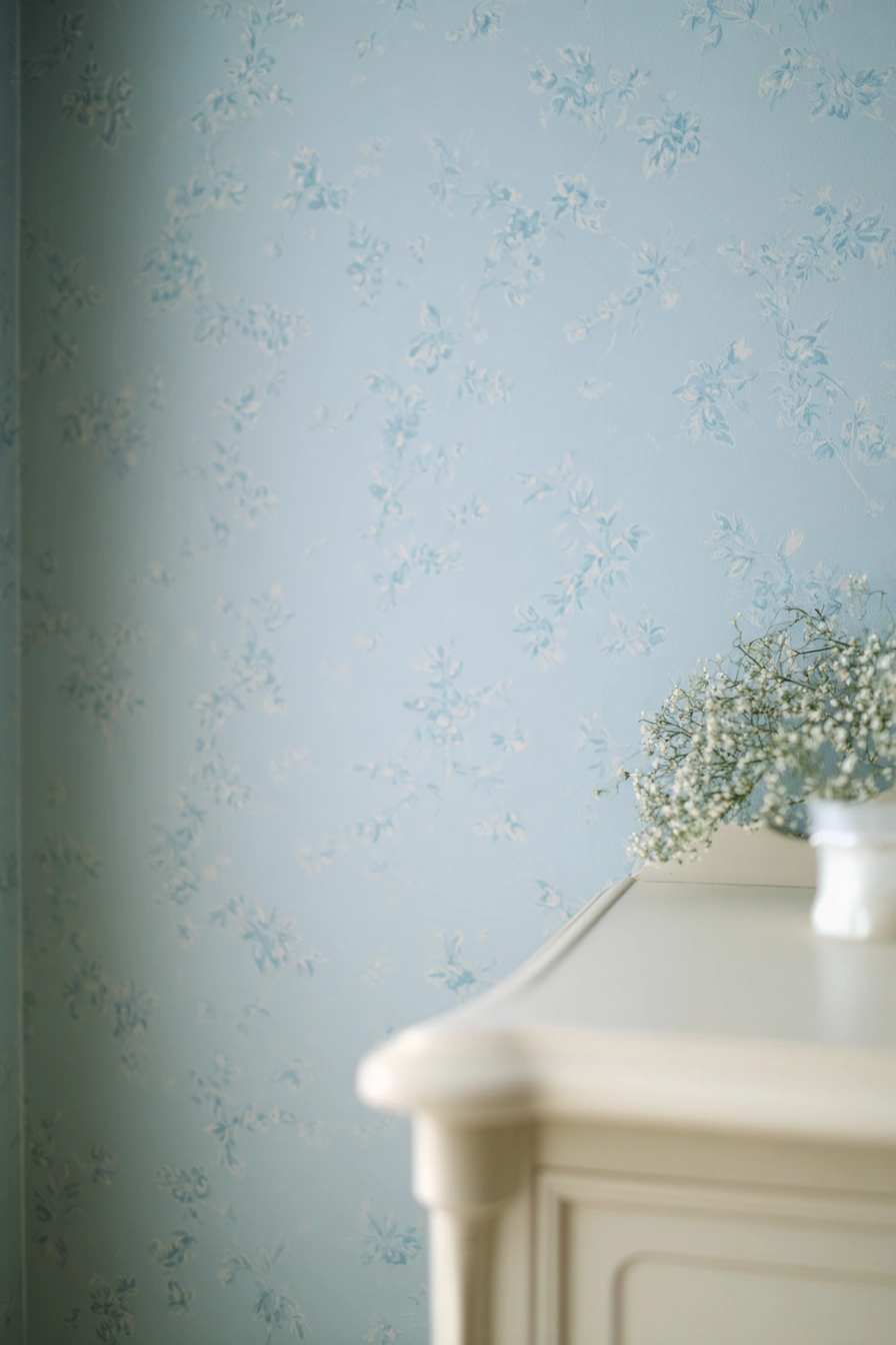
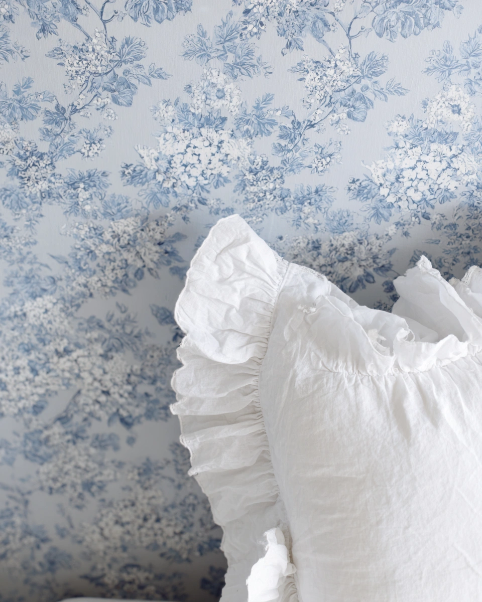
3) Soft Sky-Blue Florals
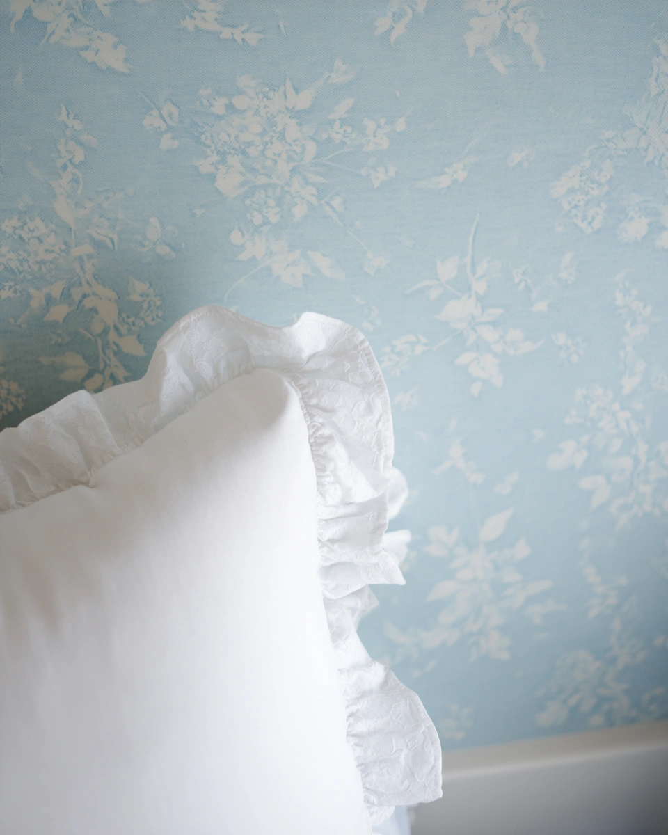
I adore how this soft blue wallpaper feels like a cozy daydream. The pale floral pattern has a vintage feel without being fussy or grandmotherly, giving a bedroom an instant sense of calm and a touch of cottage-core style. It works brilliantly in a light-filled bedroom, a welcoming guest room, or a nursery where you want a gentle, soothing backdrop. Pair it with crisp white bedding, a ruffled pillow, and pale wood furniture, and the whole space will feel effortlessly put-together and romantic.
4) Blue Bedroom Wallpaper With a Soft Watercolor Floral Pattern
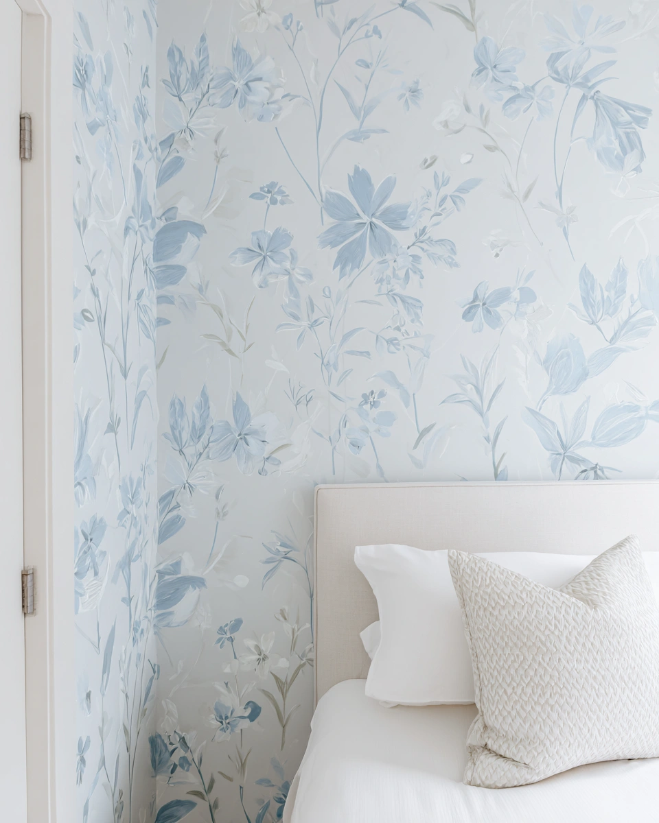
I’m a huge fan of how this blue wallpaper looks like someone painted a dream right onto the wall. The watercolor florals are delicate but not timid, with edges that blur softly into the background, giving the room a calming, airy vibe that is still full of personality. It works beautifully in a small bedroom, a guest room, or a cozy reading nook where you want to feel tucked in but not closed off.
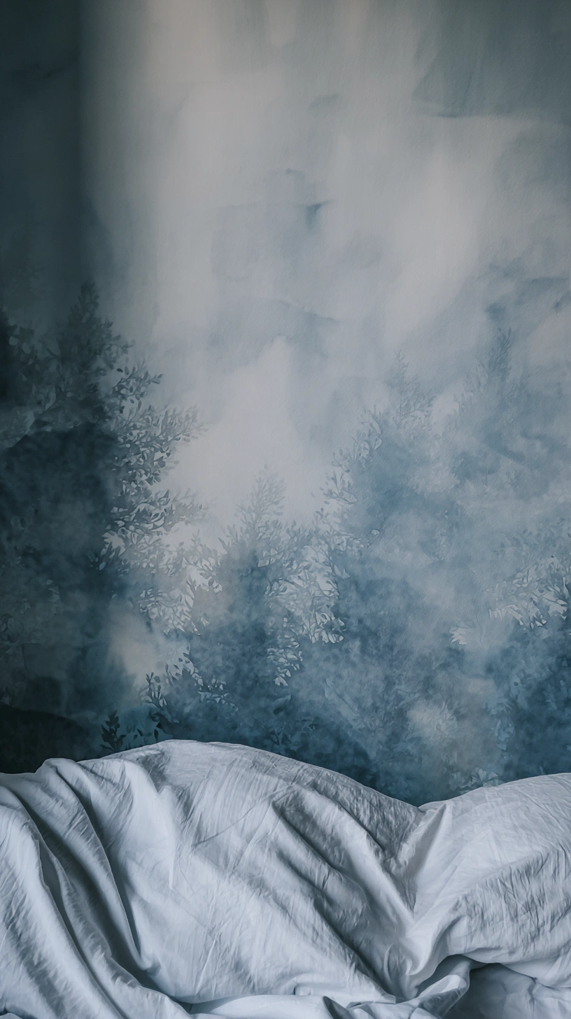
5) Soft Sky Ombre
I love how the ombre effect moves from a deep navy base to a mere whisper of sky blue at the top, as if the wall took a peaceful moment to breathe. The speckled fade in the middle reads as handmade and relaxed, creating a texture that feels intentional without trying too hard. It’s perfect as a headboard moment that doesn’t require any extra fuss. The wall itself is the art and it makes small bedrooms feel curated and calm.
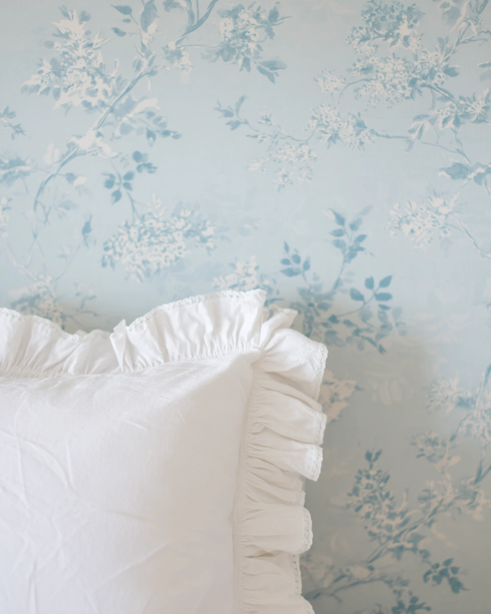
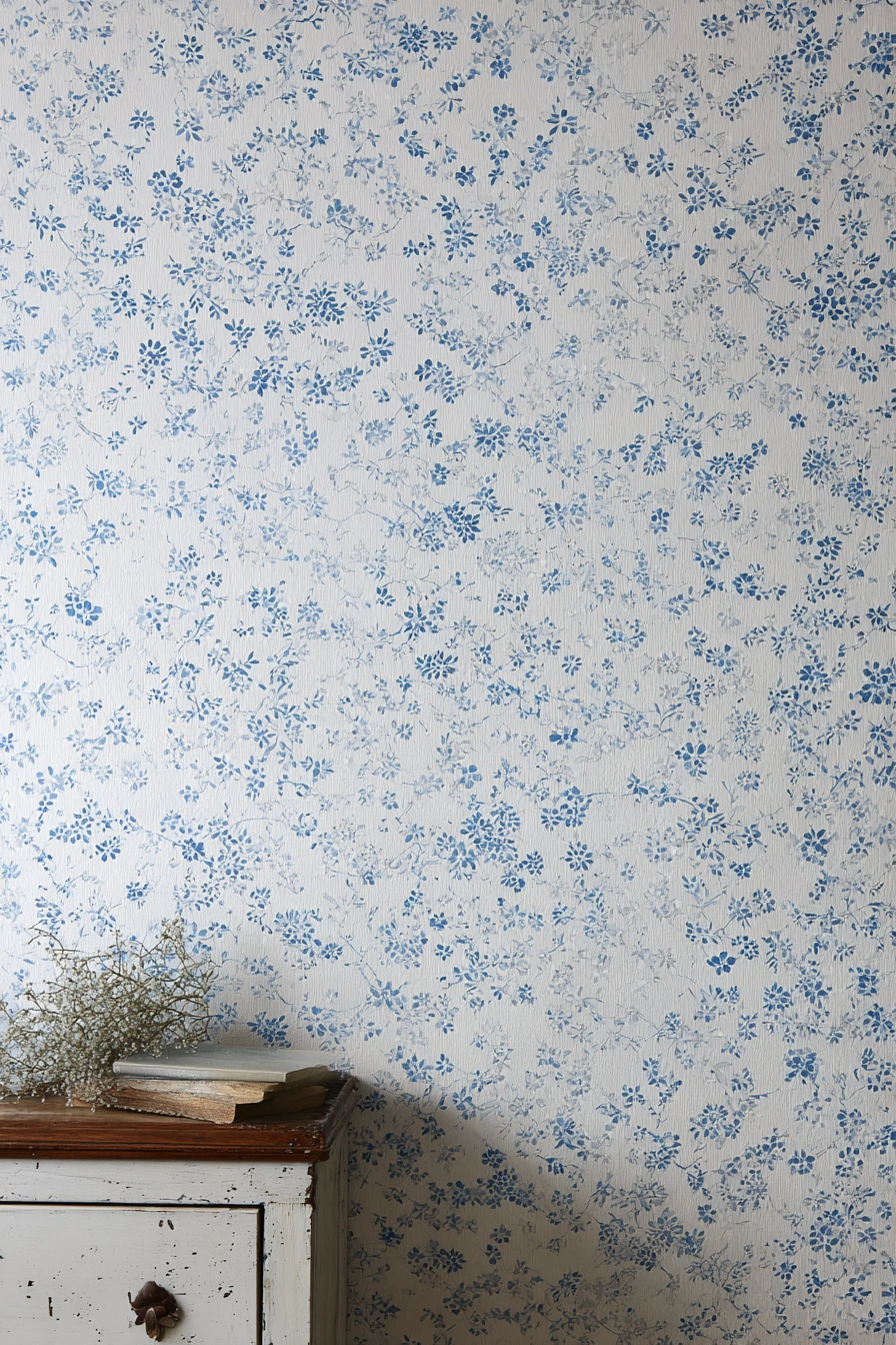
6) Soft Sky Florals
I adore how the soft powder-blue and tiny floral sprigs feel like a gentle, nostalgic hug for a bedroom. It reads as calm and airy instead of fussy, evoking the charm of English countryside interiors, so the whole room instantly becomes a place you actually want to spend time in. The print is perfect for a guest room, a nursery, or any sleepy corner that needs a little vintage charm without feeling over-the-top.
7) Soft Pastel Florals
I’m in love with how this soft blue wallpaper feels like a cozy, grown-up version of a favorite childhood blanket. The painterly floral pattern reads as calm and slightly romantic without being overly sweet or saccharine. It makes a bedroom feel like a gentle retreat, especially if you enjoy a cottage or coastal vibe. I’d happily use it in a guest room, a nursery, or a primary bedroom where you want low-key charm and light, not high-contrast drama.
8) Teal Geometric Starbursts
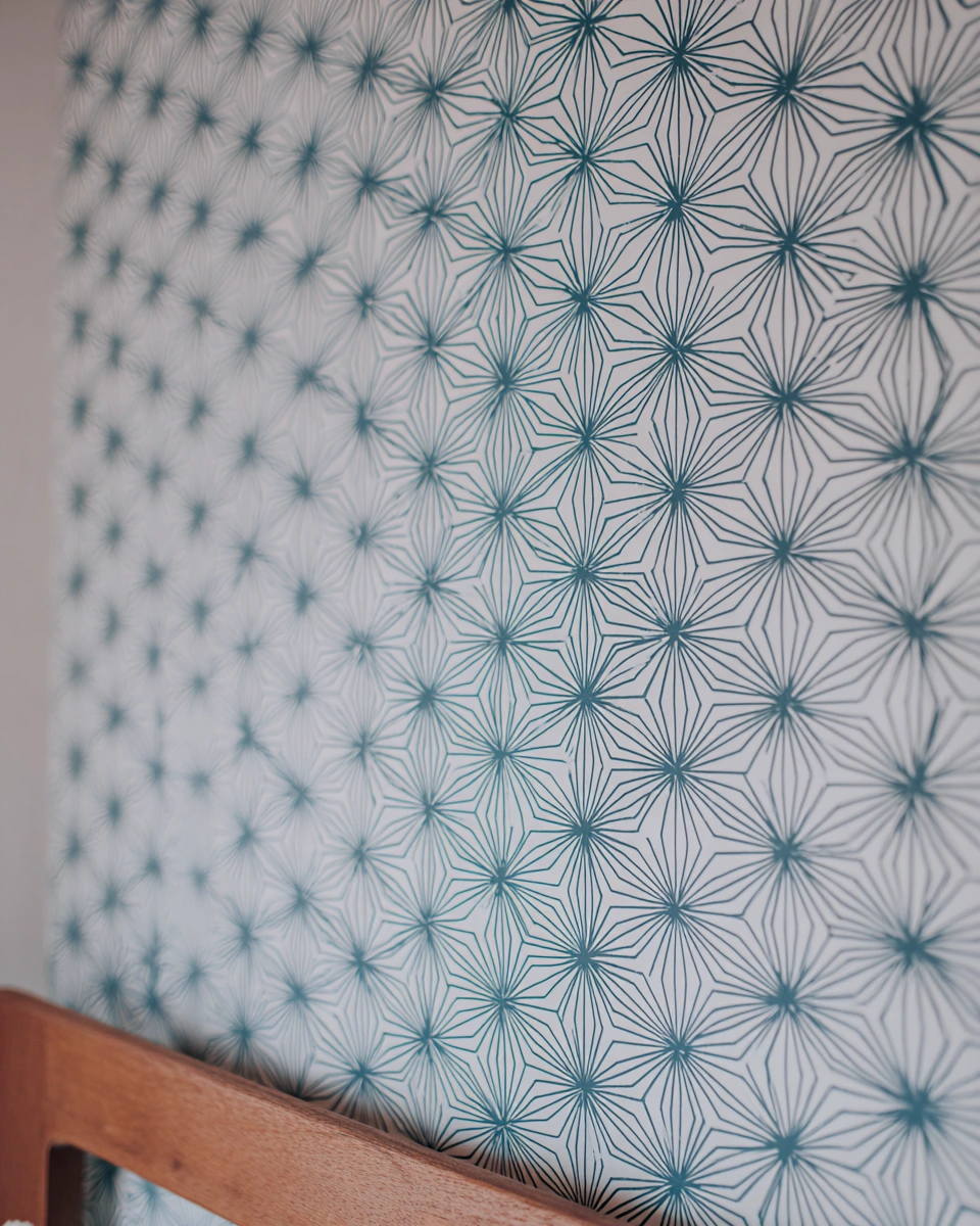
I appreciate how the little teal starbursts feel like a sophisticated take on floral wallpaper. The fine lines give the wall a sense of rhythm and structure without being loud, so the pattern reads as fresh and airy instead of busy. It looks fantastic as an accent behind a bed, especially with warm wood furniture and crisp white bedding, and it feels perfect for someone who likes a bit of vintage-modern charm without the visual clutter of traditional florals.
9) Textured Distressed Navy
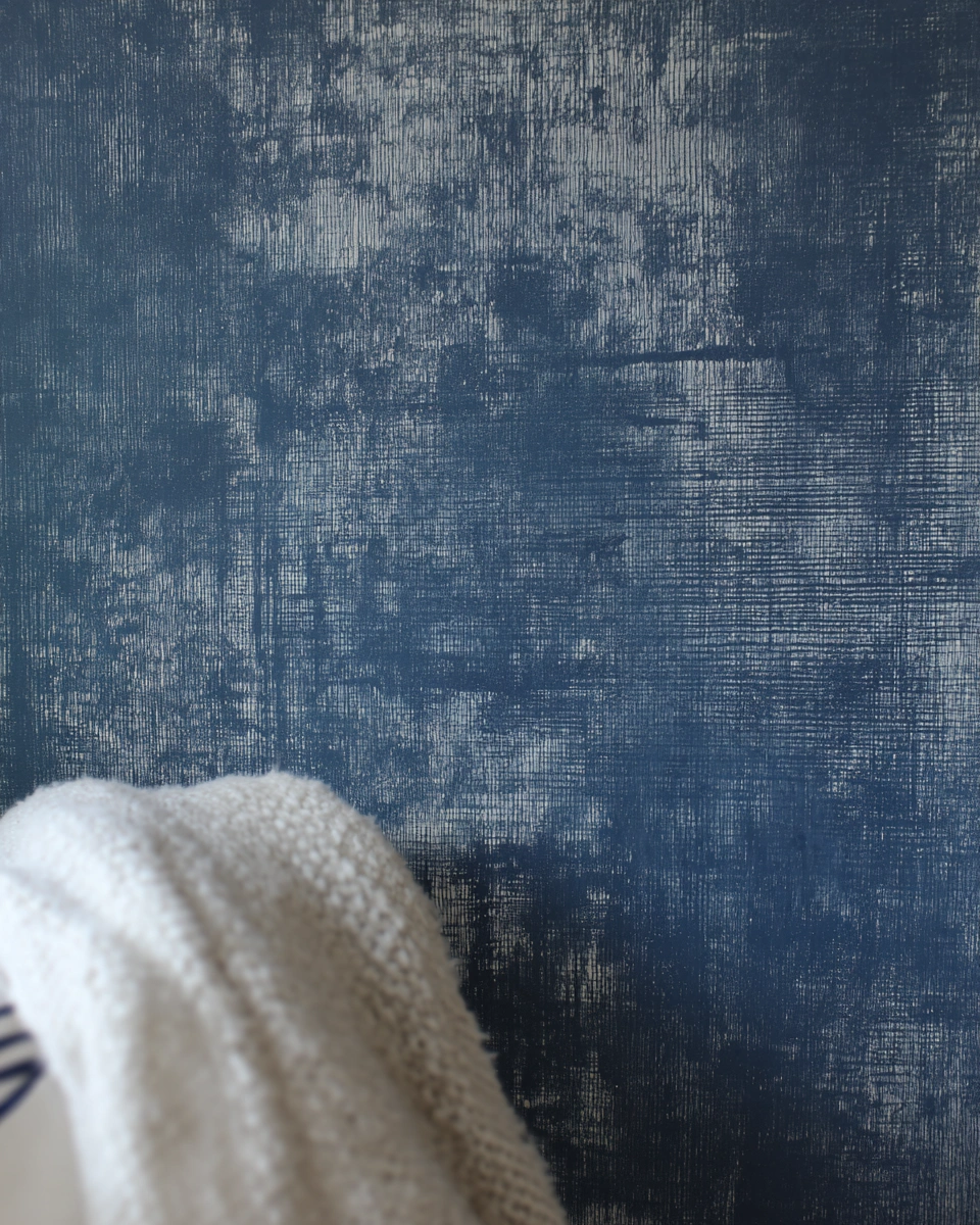
I’m a fan of how this blue wallpaper gives the impression of a cozy painted canvas, a deep indigo with whispery, worn-in marks that make the wall feel lived-in and luxurious at the same time. It mimics the look of Japanese Shibori or denim. It gives off major “soft lighting, soft life” vibes and works so well as a bedroom accent behind the bed or in a small reading nook where you want a calm but not boring atmosphere.
10) Soft Sky Botanicals
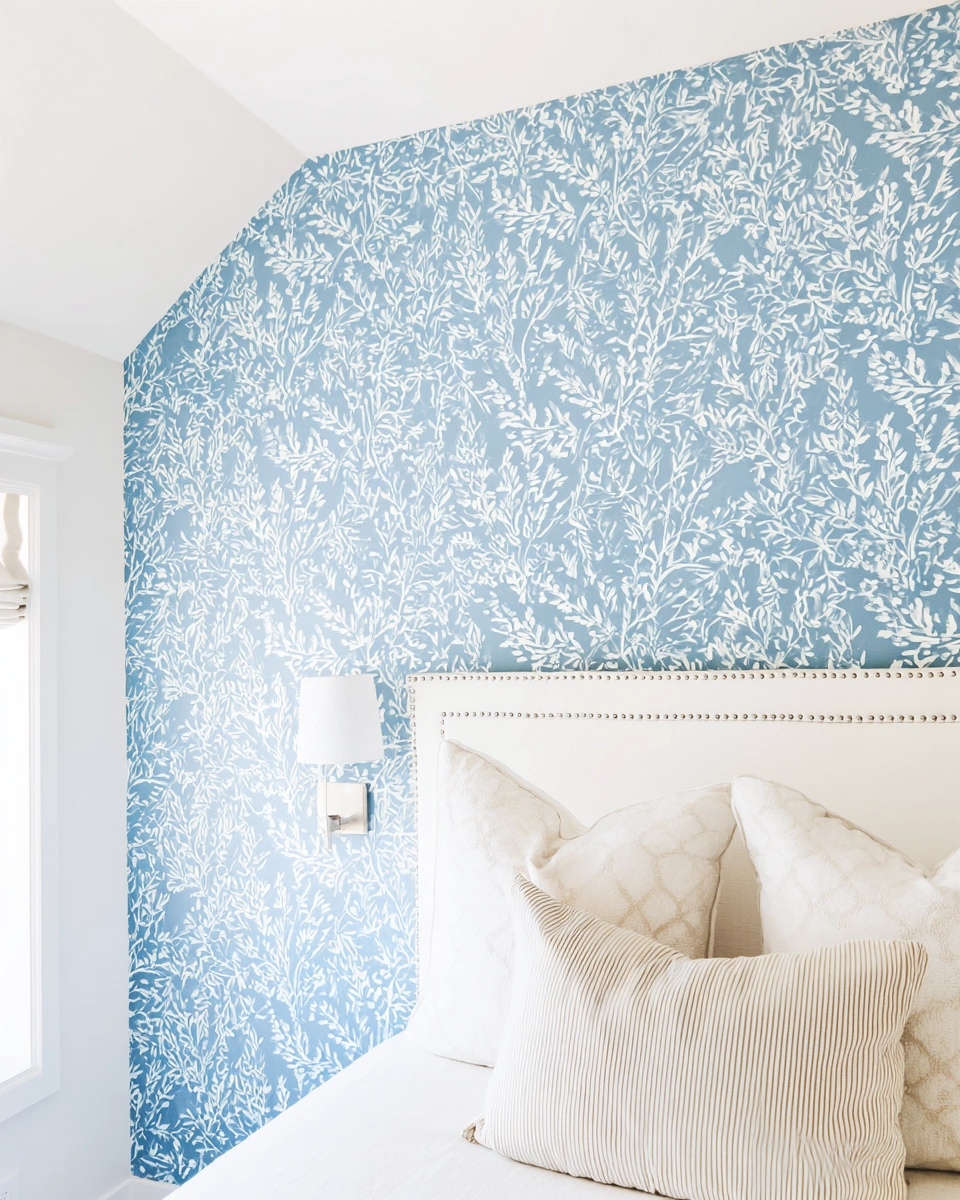
I love the fresh, breezy feel of this blue wallpaper. The soft blue base with white leafy strokes feels like a calm cottage by the sea but with a modern, effortless twist. It reads as cheerful without being loud, providing a biophilic connection to nature, and it pairs so nicely with a cream upholstered headboard, light linens, and that lovely little silver sconce moment.
11) Deep Cobalt Blue
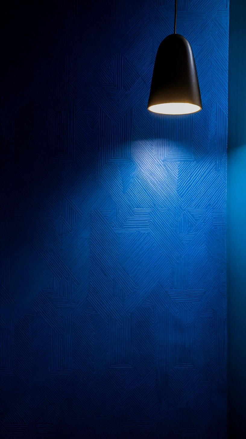
I adore the way this cobalt blue wallpaper feels both dramatic and cozy. The embossed geometric lines give the wall a sense of movement and a tactile depth that changes with the light, creating shadows that shift throughout the day. It works brilliantly as a bedroom feature wall behind the bed, in a moody reading nook, or in a hallway that needs a dose of personality.
12) Indigo Tile Pattern
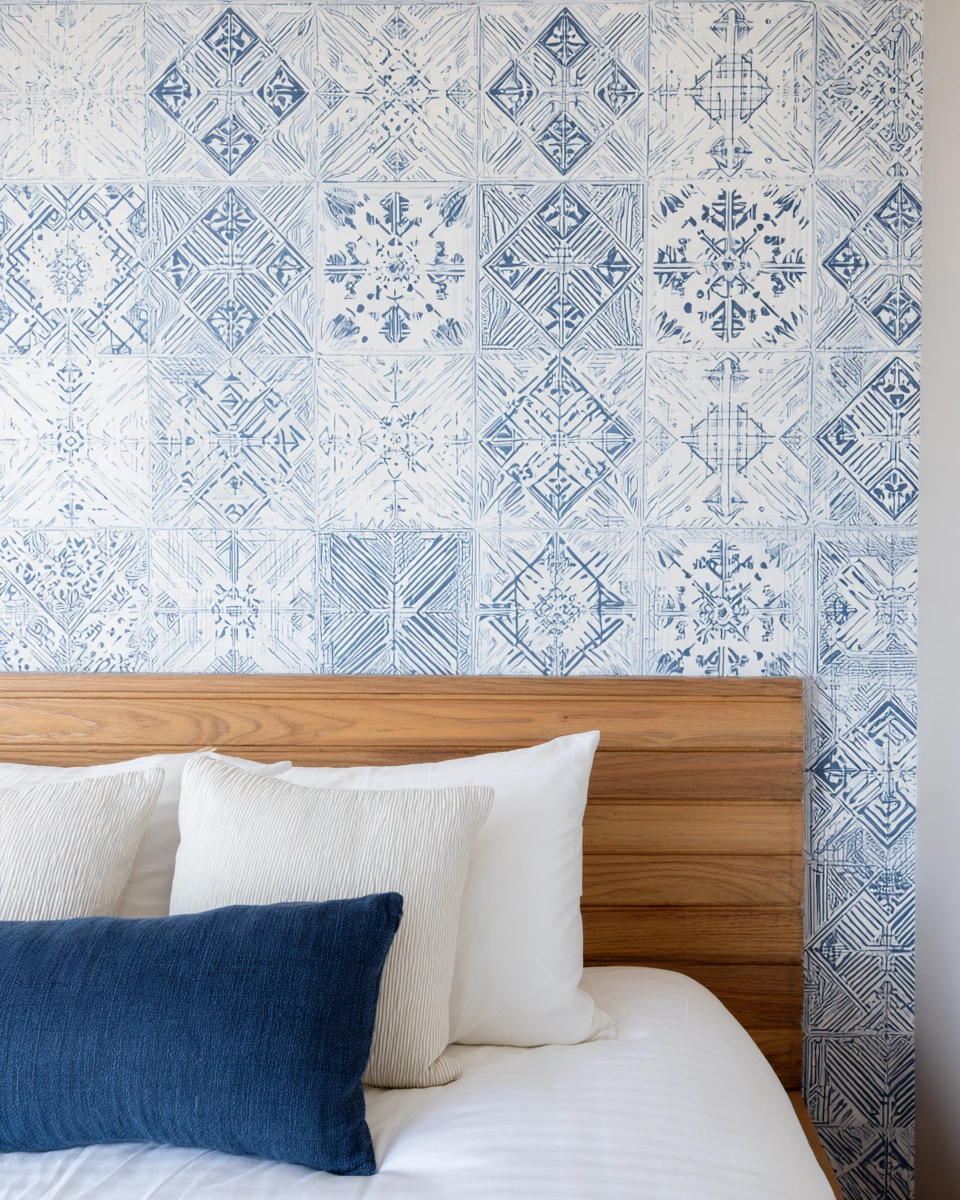
I love the soft, hand-painted tile vibe of this blue wallpaper. The faded indigo print feels fresh, not fussy, as if it’s been sun-bleached in the most beautiful way, reminiscent of Mediterranean courtyards. It reads as breezy and calm against the warm wood headboard and crisp white bedding, so the whole space feels layered without trying too hard.
13) Painterly Indigo Brushstrokes
I’m a fan of how this wallpaper looks like a giant, artistic swipe across the wall. The deep indigo strokes on a crisp white background feel fresh and playful, giving the room instant personality without becoming overly complicated. It reads as modern and a little bit coastal, abstract enough to not feel thematic, which makes it great as an accent behind a bed or in a sunny guest room where you want a focal point that still feels relaxed.
14) Vintage Delft Blue Florals
I love the soft, old-school charm of this blue floral wallpaper. The tiny blooms and faded indigo tones feel fresh, not precious, referencing classic Delftware pottery, so the whole wall reads like a calm hug. The subtle texture and pale background keep it airy, which makes a bedroom feel soothing and lived-in instead of staged or sterile.
15) Blue & Gold Art Deco
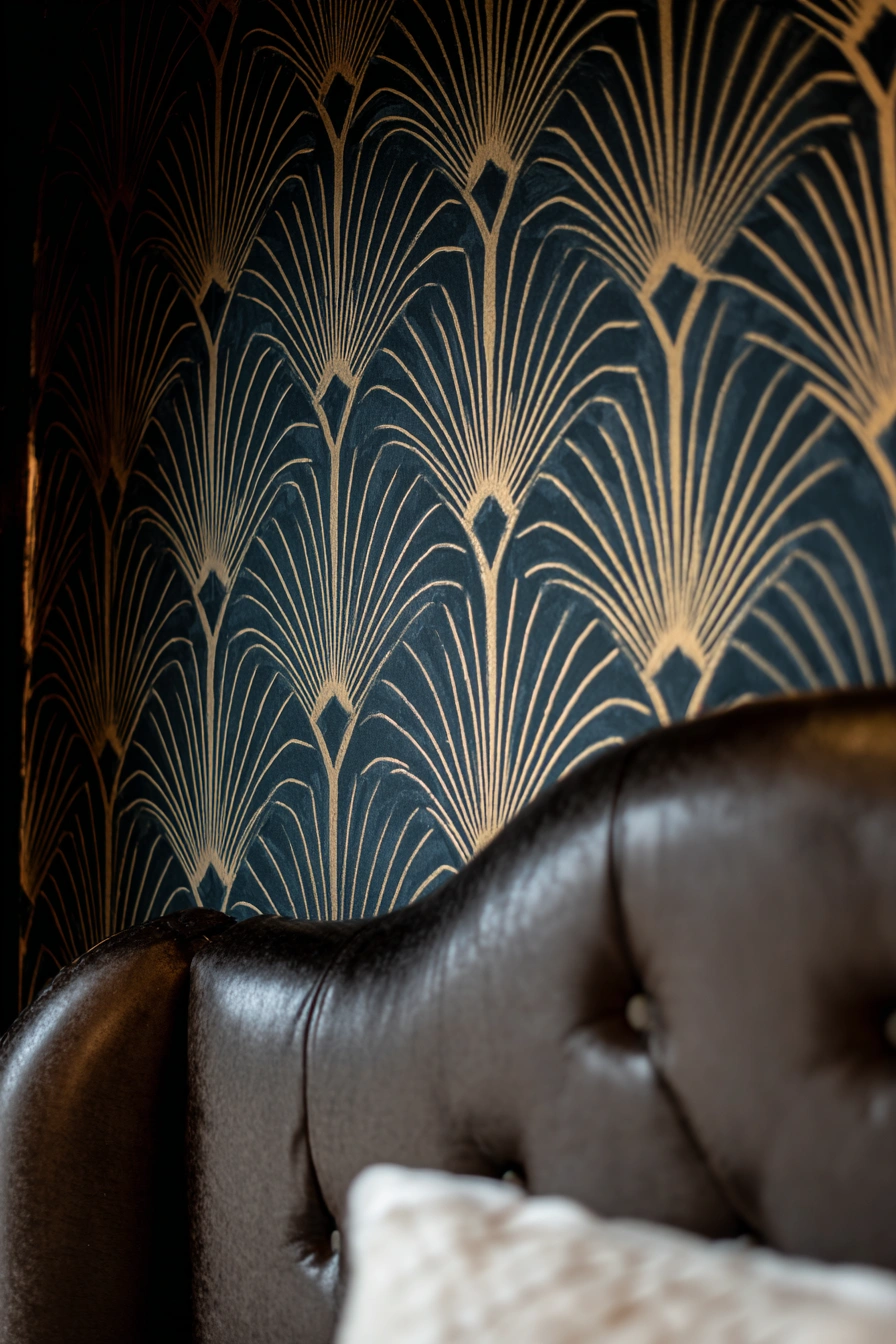
I’m drawn to the way the deep blue base plays with that beautiful gold fan pattern. It reads as quiet glamour moody but not fussy and instantly makes the bed wall feel intentional and expensive. It’s a perfect backdrop if you want a cozy, boudoir vibe or a grown-up guest room that still feels fun, channeling the opulence of the Roaring Twenties.
16) Hand-Painted Sky-Blue Geometrics

I love that this wallpaper looks hand-painted but in a chic, low-effort way. The watery blue geometric pattern feels fresh and coastal without being overly sweet, and the white background keeps the whole thing airy. It pulls a bed into focus and plays really well with warm wood, crisp white linens, and a little textured throw pillow for contrast, striking a balance between structure and softness.
17) Soft Powder Blue Florals
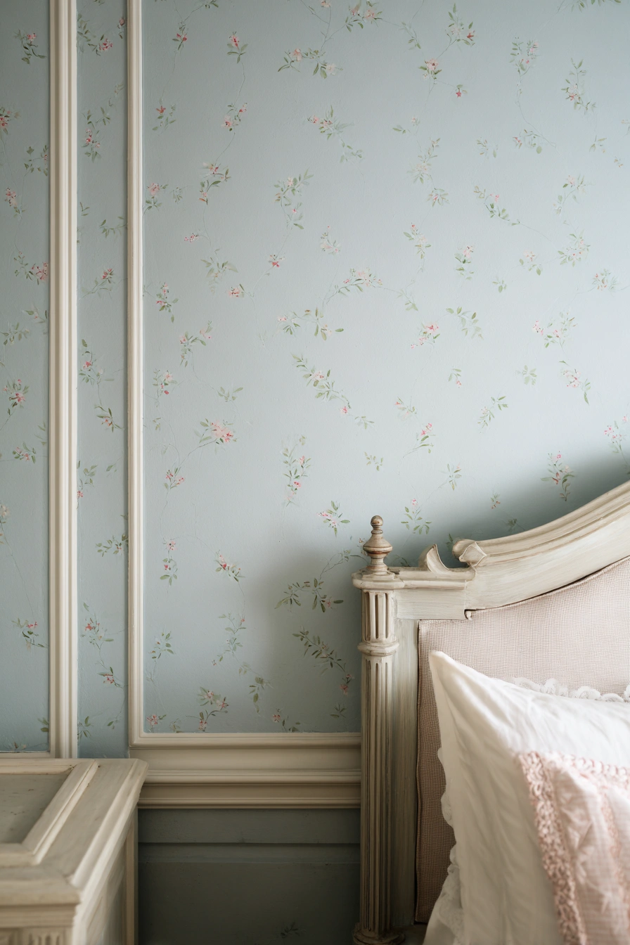
I adore how the soft blue feels like a deep exhale. The tiny hand-painted floral sprigs keep it feeling delicate and not fussy, so the wall reads as romantic without screaming vintage museum. It pairs so nicely with cream moulding and a faded, carved headboard, which makes the whole space feel lived-in, calm, and evocative of French country estates.
18) Cottage Blue Florals
I’m a fan of how this soft blue floral feels like a vintage postcard that has been updated for everyday life. The delicate blooms and painterly leaves read as calm and pretty, not fussy, so it gives a bedroom instant personality without shouting for attention. It’s dreamy behind a bed, sweet in a nursery, and surprisingly chic in a small guest room where you want a big mood with low effort.
19) Classic Gold Art Deco
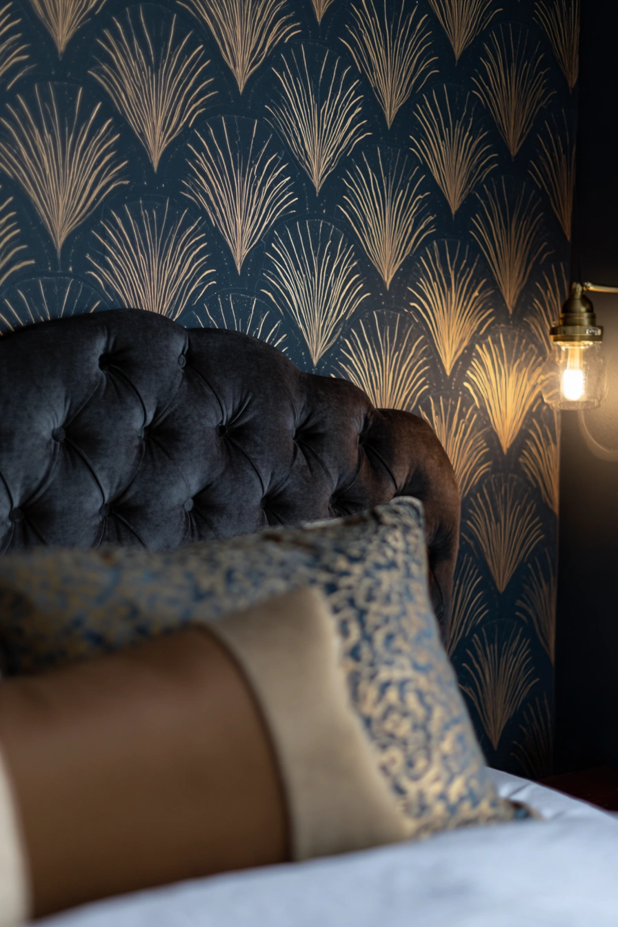
I love how the deep blue background and gilded fan pattern feel moody and joyfully luxe all at once. The design reads as grown-up glamour without being complicated, utilizing the complementary color theory of blue and gold. It plays beautifully behind a tufted velvet headboard or with a brass bedside pendant. It makes a small bedroom feel cocooned and a guest room feel like a boutique hotel stay.
20) Soft Blue Watercolor
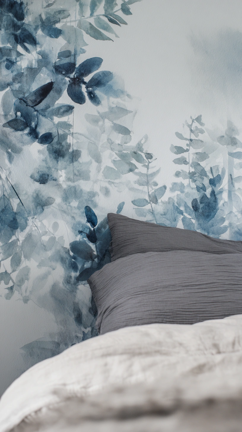
I’m drawn to the watercolor wash of blues and soft leaf shapes here. It reads like a gentle, grown-up wallpaper that still feels playful and fluid. The white space keeps it airy, so it becomes a calm focal point instead of a visual shout. It’s perfect for a bedroom or guest room when you want a soothing vibe that still has character and artistic flair.
21) Soft Sky Florals
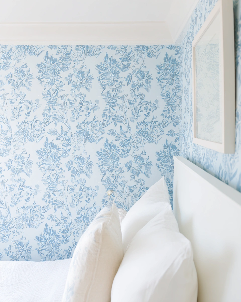
I love the soft, painterly vibe of this blue wallpaper. The pale sky-blue background and loose floral pattern feel fresh without being overwhelming, so the room reads as calm and curated. The scale of the print keeps things light, which makes the wall a gentle focal point instead of a major showdown, ideal for those who prefer subtle elegance.
22) Misty Indigo Botanicals
I adore how this blue wallpaper looks like a watercolor sky melting into leafy silhouettes. The layers of misty indigo and soft teal feel cinematic but gentle, creating a sense of depth and mystery, so the whole wall reads like a cozy backdrop rather than a loud pattern. It gives a bedroom instant calm and a touch of drama at the same time, which is exactly my kind of mood.
23) Airy Coastal Blue
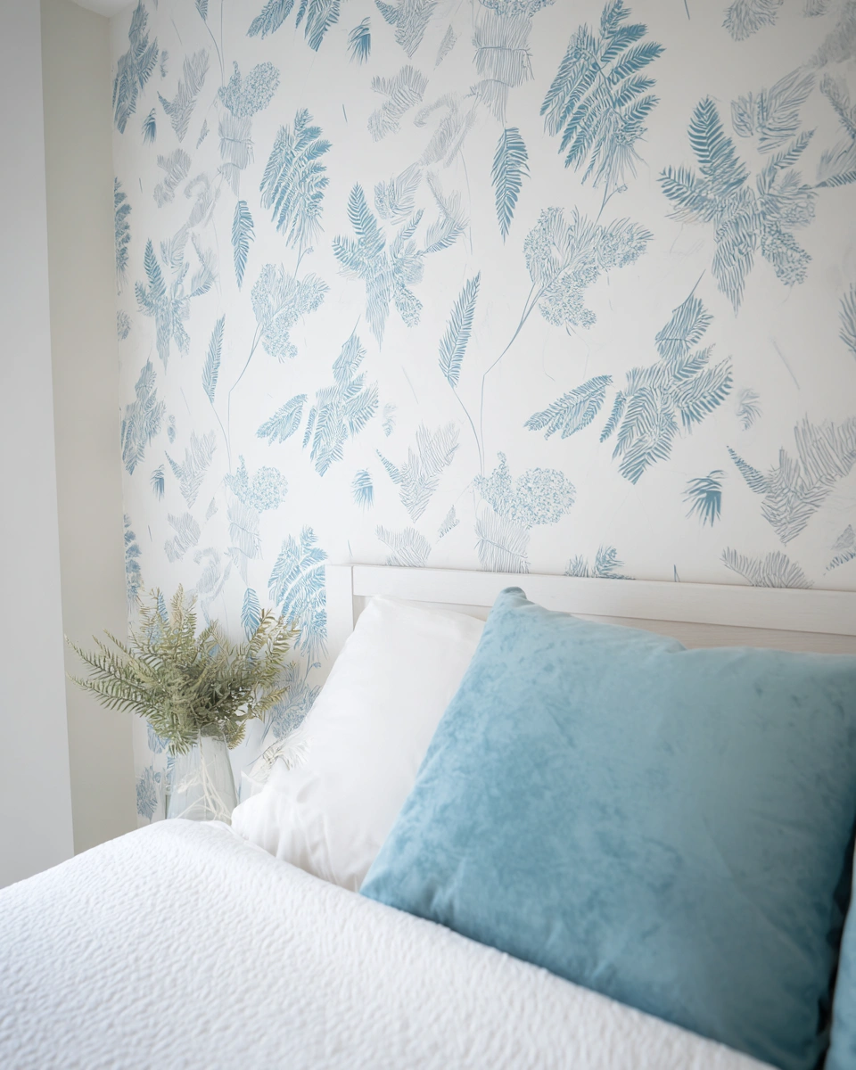
I love how the whisper-blue botanical print feels like a breath of fresh air. The delicate fern sketches on a creamy white ground keep things light and calm, so the wallpaper reads as fresh and slightly coastal without being cliché or nautical. It’s perfect for a bedroom that wants to feel soothing but still a little stylish and connected to nature.
Expert Styling: What Goes with Blue?
Blue is versatile, but pairing it correctly is what elevates a room from “nice” to “designer.”
- The Metallic Rule: Contrast is key. If you choose a deep Navy wallpaper, pair it with Brass or Gold fixtures. The warmth of the gold cuts through the darkness of the blue, creating a luxurious, high-contrast look. Conversely, if you opt for Icy or Powder Blue, pair it with Chrome or Silver to maintain that crisp, airy, and modern aesthetic.
- Wood Tones: Blue is inherently a “cool” color. To prevent your bedroom from feeling like an icebox, you must introduce warmth through wood. Walnut and oak furniture are the best friends of blue wallpaper. The yellow/orange undertones in the wood sit opposite blue on the color wheel, creating a perfect, harmonious balance.
- Bedding Choices: You have two main paths here. For a hotel-like, crisp look, stick to pure white linens. If you want a moodier, more eclectic vibe, layer in throw blankets in mustard yellow, terracotta rust, or burnt orange these earthy tones will make the blue walls pop.
Practical Tips: Accent Wall vs. Full Room
Deciding how much wallpaper to use is just as important as the pattern itself.
- The Accent Wall: Choose this route if you are using a large-scale geometric print or a dark navy. Applying a bold pattern to all four walls can make a small bedroom feel claustrophobic. Instead, place the wallpaper on the wall behind the headboard to anchor the bed and create a focal point.
- The Full Wrap: If you are choosing a subtle texture (like faux grasscloth) or a light, airy floral, be brave and wallpaper all four walls. This creates an immersive, “jewel box” effect that is incredibly soothing. The lack of contrast between walls stops the eye from bouncing around, creating a seamless, restful environment.
- Renters Take Note: If you are in a rental or just indecisive, Peel & Stick wallpaper has come a long way. It offers the same visual impact as traditional paste but can be removed in minutes without damaging the drywall.
Conclusion
Blue is the safest, most timeless investment you can make for your bedroom walls. It is a color that transcends trends, offering a perpetual invitation to slow down and breathe. Whether you gravitate toward the dramatic embrace of a midnight geometric print or the gentle whisper of a watercolor floral, there is a blue wallpaper that fits your unique definition of serenity. We encourage you to order a few samples, tape them to your wall, and watch how the light changes them throughout the day. Your sanctuary awaits.
A nascent fascination with spatial composition emerged in my youth. I was the child consumed by the perpetual metamorphosis of my personal quarters, constantly conceiving new chromatic dialogues. This journey has evolved into an exhaustive exploration of diverse design vernaculars, driven by a captivation with how environments articulate identity. These spaces tell our stories. Now, I endeavor to disseminate this cultivated erudition.